The site that I talk about in this post never gained any traction and I lost interest. The domain expires in a few weeks and I’ve taken the site down. So there’s no where to go and see the live site anymore. But I’m going to leave this post up beause the CSS should still work.
A week or so ago I setup a site that I’ve been thinking about for a while, mostly as a place where I could play around with the new pieces in WordPress 5 without messing with an existing site.
The Twenty Nineteen theme was one of those things I wanted to give a go. I like really simple themes, and it seemed like a good starting point.
But I also like grid layouts over the standard list of posts. In the past I’ve written child themes or plugins to do this, but I wanted to see how much I could do with just a bit of CSS
And here’s what I came up with.
body.blog #main,
body.archive #main {
	display: grid;
	grid-template-columns: 32% 32% 32%;
}

@media (max-width: 400px) {
	body.blog #main,
	body.archive #main {
		grid-template-columns: 100%;
	}
}

body.blog #main article,
body.archive #main article {
	margin-top: 0;
}
body.blog #main article .entry-content,
body.archive #main article .entry-content {
	display:none;
}
body.blog #main article footer,
body.archive #main article footer {
	display:none;
}
body.blog #main article .entry-header h2,
body.archive #main article .entry-header h2 {
	font-size: 1.25em;
	white-space:nowrap;
	overflow: hidden;
	text-overflow: ellipsis;
}
body.blog #main article > *,
body.archive #main article > * {
	margin:8px;
}
body.blog #main header,
body.archive #main header {
	grid-column-start: 1;
	grid-column-end: 4;
	margin-bottom: 0;
}
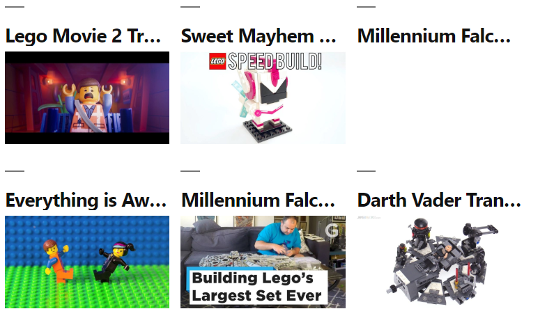
It turns the #main element into a grid container and each of the article containers into grid elements. I went with 3 across as the default, falling to 1 across on mobile.
I did have to tweak a bit on the archive pages. The header for those pages is inside the #main element, so it became a grid item. Instead of messing with it too much I just set the header in that case to span all the columns so that it still looked right.
You can see what it looks like at BrickZone.club, assuming that I haven’t tweaked a little more since then.
It worked for me. I made a few changes but a perfect start.